These designs are potential logos for the name of my music magazine.

I designed this logo to look unique to any other logo within this magazine industry, by doing this it creates a sense of difference for the audiences within this area. I chose the colour red because its a potential connotation to danger, and gives a sense of risk taking to the audience, which is how they might perceive the music. Furthermore, i chose the name rouge as it means red in France which carries on with my idea of the connotation that the audience could make. The style front i used is called 'bloodwax', i chose to use this as it has an eye catching style which is what i need to attract my audience. Also, the letters look quite soft which continues on with the theme of my music, soft rock. Ive tried to link in all my ideas of my music to the structure of this logo, as it would represent this to the audience. The style writing also looks quite edgy which could connotate to the band that their personalities and music style is on the edge. The style also looks quite modern which could attract the readers to this magazine as its not an old age style like other magazines already in the industry. By looking at other music magazine logos, i have not come across any that would perhaps be seen as similar to mine. I have done this to ensure that my logo is unique and stands out within this industry, also as its new to the industry it would attract more readers as they like the thrive of new things and want to explore them. This is the logo that i am going to use for my music magazine as i feel it has the potential to attract many readers due to its new stylish features and the colours are more vibrant and it represents the characteristics of the style of my music.

Photo Shoot For Music Magazine
For these photos i tried to use as many different angles as i could, ranging from close ups, high angled shots, low angled shot and tilted camera shot. I edited the pictures so that the colours of the clothing and different coloured hair would stand out. For every person i asked them to wear an item of red as the name of my magazine is 'Rouge' which means 'red' in French. So when i edited the photos it allowed me to make the red items, including; hair colour, flower, ribbon and diamonds on a top stand out and to be the main focus feature. I chose to use a woodland setting for my photos as i thought this would be a rough looking rocky style setting, which could relate to the aim of the style of my music, soft rock. I took group photos and single photos as i thought this would ensure that i got a variety of shots and photos giving the girls a shot to show their features and style.

I took this image from a low angle so i could get the full body of the girl in. I did this so if this was in my magazine people would look up to the girl, maybe being seen as a role model the the audience. I edited this picture to black and white because i wanted an old style looking photo as all my other ones were full of colour and i wanted a different approach to my pictures.

I took this picture with the girls each posing sat in a different position to allow for each personality to shine through. As you can see the main girl who is set up in the middle is striking a pose looking slightly away from the camera and sat up right, showing dominance and power. Also this frame makes her seem like the main focus which draws all the attention to her. I did this as her hair is red which connates to my magazine name 'Rouge' which means red in french. The other girls are looking down both representing the colour red, through a flower in one girls hair, and red nails on the other. I tried to do this to really get my magazine across through colour connotation.

Ive edited this picture so the background is white which ensures that the colours stand out. Ive used this girl for this type of picture, as she had bright red hair which i could edit to make it stand out even more, this would link up with my magazine name. Also her top is blue which connotates with the themed colour on my final front cover.

This is the picture used for my front cover, i cropped the other 2 girls out and used the girl on the left. I also cropped out the bottom of the window and some of the top so it just had the window fading in to the picture. I felt this would give the front cover a nice effect. Also by using this picture it gave me ideas for my colour theme, i used red which connotates with her hair also linking with the hidden meaning of my magazine name, i used blue which works well with her blue top as this matches and creates a link.

I took this picture as i felt it gave a proffesional look to the picture, due to the mise en scene of the shot. It also gave a long shot which showed the girls ful bodys, i thought this would give a funky effect to the magazine. Also, having a this mise en scene it gave the magazine a variety of shots and pictures.

This shot was quite a serious looking one, the photo looks like it has deep meaning, with them all expressing the same expression, all looking into the camera lense so as readers we feel connected to the artists. I felt i needed a more serious shot within my magazine, to present the rock theme, as its not al fun and games there are serious parts to this music. I felt this picture represented those serious factors well.

This photo is from a low angle shot to make the girls look dominant, there facial expressions also achieved this goal. By doing this, it creates a sense of the 'rock' theme by being bulky and serious by the way they are representing their body and facial expressions. Also, this could also be a way of the audience looking up to the girls and in some sense idealising them. Representing them as role models to their audience.

I took this photo from a tiltered angle to give an edgy look to the phota. Also, i felt this shot worked well to emphasise the red features in this shot. My main focus were the red items as i felt this connected well to the name of my magazine. In this shot the red items are, the hair of one girl, a ribbon, a flower, a top, lipstick and nail colour. By editing the colour of the photo, it allowed these items to be the main focus and stand out.

This shot is a close up shot, i did this to frame the elements of the picture that i wanted to use. I edited the colour of the picture by tinting it with the colour red do emphasie further my theme of red, connotating with my magazine title. She is looking away from the camera which creates curiosity for the readers, pulling their interest in more.

Ive taken this shot at a straight on angle to make the main focus the girl, by doing this i cropped out some of the mise en scene to achieve this. Her posing in this manner gave a sexual appeal to the photos, i did this on order to attract the male gender and make it appealable to them, therefore not making my magazine gender bias.


Ive taken this shot from a high angle to put the girls at a different place with the audience. Instead of being domiant the audience can look down on the girls and the power role changes, which the audience may like. Also, it could show that anything the girls can do the audience can do to, showing that anything is possible within the music industry.
Potentail Page Layouts
Front cover

This is a front cover layout which i designed to give me an idea of how i wanted to lay mine out and what text and images i wanted to put where.
Contents Page

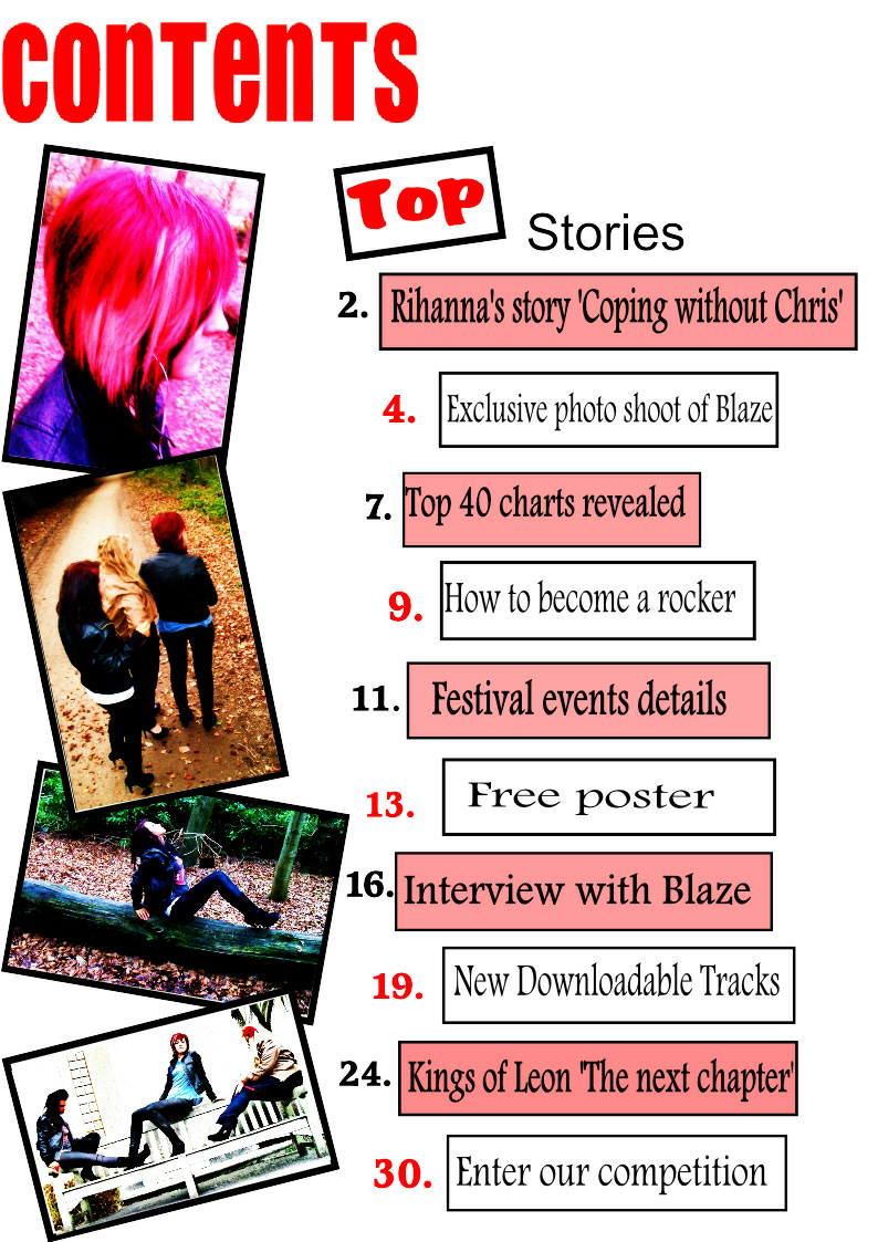
This is the contents page layout which i designed to give me an idea of what things i need to include within this page and where i would place these things.
Front cover 1

This is the front cover that i am going to use for my magazine. I have chosen to use this cover as i feel it represents my type of music style in the best way. I have chose to use a red and blue colour theme, red as this connotates to my magazines logo, 'rouge' meaning red in French. I chose to use the colour blue as this is the colour of the characters top. I chose to use this photo from my photo shoot, as i felt it represented the colour red the best as this was my aim as i wanted it to connotate with my logo. The girls hair represents the colour red and i edited to make sure it stood and was the main focus. I chose to put the girls head in front of the logo as i felt it gave a professional look and made it seem as if the the magazine was well known. Many magazines do this as the magazine is well known therefore they can cover it, still ensuring that people will purchase it. I decided to use different fonts as this allowed for the magazine to have uniqueness upon all other magazines. I made words such as 'win' and 'you' in bold as this strategy would be eye catching to magazine readers and make them feel involved even before reading the magazine. I used the word 'exclusive' in bold at the top as this would be one of the first things the readers would see and would make them feel as if they are gaining information other haven't, in some sense makes them feel superior to everyone else.
Front cover 2

I designed this front cover with the same features, however i chose to use a different colour theme with an orange, red and black theme, i decided to do this as it created a sense of 'rock' through the theme which is what i wanted to create as this was the style of my music. Although i have decided not to use this front cover as i felt it didn't have as much meaning as front cover 1 and didn't connotate as well as that did. Also i felt that the colors red and orange were too similar and they drowned each other out which wouldn't capture the readers attention. I felt that the colour orange was too tropical for my rock theme and didn't connatate well with my chosen music theme. Furthermore, to me it seemed the front cover looking like this was quite messy and didn't fit the aims that i wanted for my magazine. Generally i didn't think that the colours worked well together as i felt the theme concluded off too many similar colours, compared with front cover 1 where they were both striking colours.
Front cover 3

For this front cover i just chose to use the colour black to see how it would look without a colour theme. By doing this i decided that i didn't want to use this front cover as my final one as it looked to ordinary and bland and i felt it wouldn't catch the readers attention which was my aim. Also i felt as if there was too much black, as well as the writing being black the girls clothing is also black. It didn't seem to represent to my theme 'rock' and didn't have any unique features like the other covers i have designed. As my logo connotates to the colour red i thought that the front cover would need some of this colour to represent this. Again this didn't have a theme that i would see as connotating my music theme, i feel that if this was in a music store it wouldn't be purchased as it doesn't have eye catching features. Furthermore, it seemed to be more like a newspaper than a music magazines due to the plain black writing and this is not the message i wanted to send across to my audience.
Double page spread 1
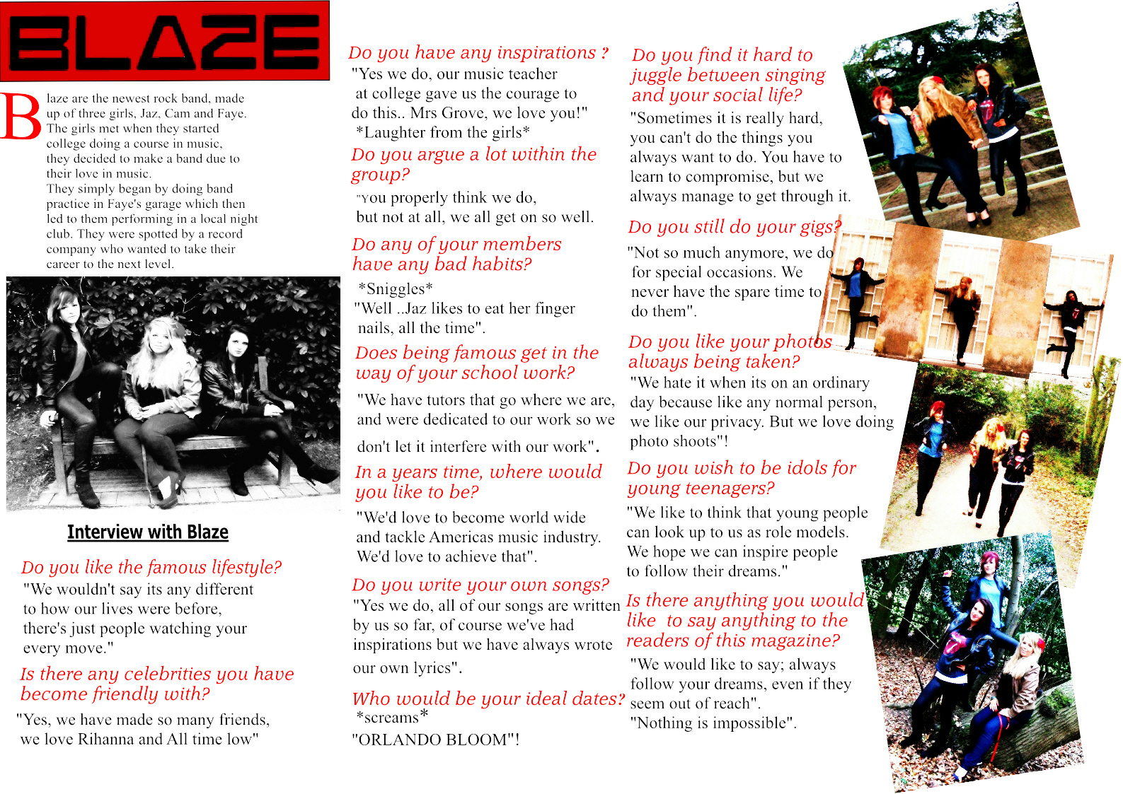
This was the double page spread that i decided to use as my final artefact. I designed this to have an edgy look which was my aim, i felt this one had the best features to present this look. I tried to carry on my colour theme through out which is why i used the colours red and black. I felt these colours blended well together to create the edgy look i was trying to get across to the audience. Also, the colours represented different things in more depth, the colour red, linked with my magazine name and black, which reflected the rock essence of my muisc. I also had 2 different style fonts as this reflected the serious mature part of my magazine, and the italic font to reflect the fun edgy part of my magazine. Also, in order of doing this it gave my double page spread a more complex look rather than plain and simple. I tried to make the amount of pictures and text equal so one didnt over power the other as this wouldnt of worked well together. I tried to make the pictures look similar to a scrapbook, to achieve this i tilted the pictures and overlapped them to give them the messy look to this page. I chose to make the main focus of my double page spread an interview, this was because i thought it would be an asset to my magazine. Also, by looking at current articles this is one of the main things that they use so i wanted to use this convention within my magazine. I felt that this double page spread was the most professional looking which was what i aimed to achieve.
Double page spread 2

When designing this double page i tried to make it look bold and almost like a newspaper print writing. But whilst doing this i decided that this wasnt the best look for my magazine as it didnt follow any of the conventions that i wanted to. I felt that it didnt reflect my music in the way i wanted it to, i didnt think it didnt represent rock which is important for me. By just having black writing it looked to plain and boring for a double page spread, as this is the main focus of the article. It didnt look like i had put much effort in when designing this as it looked too simple and no imagination within my designs. Therefore i decided not to use this double page spread as it didnt represent my music in the ways i wanted it to.
Double page spread 3

When designing this double page spread i tried something different and just had one picture on the page. I did this in order to make the picture the main focus on the page, however i felt that all the writing over powered the picture and it didnt work well together. Also, i felt that the page had no creation to it as the writing covered the whole page and was in columns which made the design looked too plain and simple. By looking at current double page spreads in music magazines i notice that i didnt follow as many conventions from theirs as i would like to of. By looking at my double page spread it doesnt look like a proffesional one like my aim was to do which is why i decided not to use this as my final artefact.

Contents page 2