My Front cover

I designed my front cover using the knowledge i have gained from my research and trying to use the conventions i have learnt about. Firstly, i put the artists head infront of my magazine logo as this followed a convention that is often used within magazine front covers. I decided to use this as i thought that it would give the impression that my magazine was popular, as by doing this it shows that the company doesn't have to show the full logo because it is already well known. I decided to use the colour theme of red, blue and black. I chose these colour red as this linked with the meaning of my logo 'Rouge' which means red in french, i also liked the idea of having a deeper meaning to my magazines themes rather than random things. I chose to use the colour blue as it colour matched with the artists colour top, i did this also for the deeper meaning and because the colours would match rather than odd ones. I chose the colour black because this reflected the style of my music, rock, which gave the impression of serious and bold attitudes. I thought this colour also represented some of the pictures that are included within my magazine, for example some of the serious composed ones that i have produced. I included teasers within my front cover as this would be a way to the audience and a method of interaction with them. Words such as 'first views' involves the readers and makes them feel as if they are getting an insight before others. By using these words it ensures that my magazine will appeal to the audience. I included the information about the competition as this would make the audience want to purchase the magazine just so they can enter the competition. I decided to use text that would personally address the audience, in this case i used the word 'You' in capital letters as i felt this would be an opportunity to receive more attention from the public. By doing this it allows for my magazine to be more appealing to audiences. I chose to use 5 different fonts as i wanted different fonts to represent the importance of some information, for example the word 'exlusive' is in a bold rocky font which i felt would stand out more and be more eye appealing to the audiences. Also, i wanted to give my front cover a variety of fonts to reflect the styles of rock which can vary alot.
My double page spread
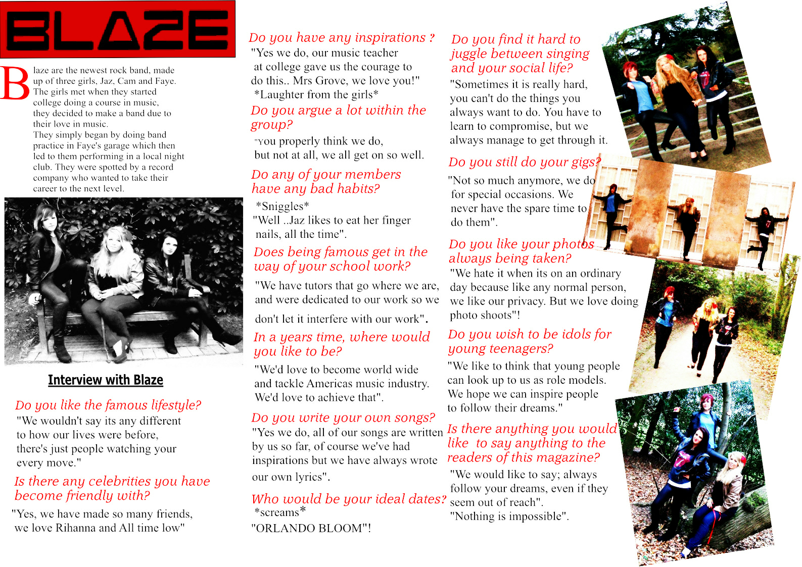
For my double page spread i looked at existing magazines for ideas on how to present my own. By doing this it gave me ideas of how mine should look, and how to make it look professional. The first thing i did was designing my bands name which is 'Blaze', i did this choosing a font that would represent my style of music.I made it the main focus as this would catch the readers attention ensuring that they would read on. For my first piece of writing i used a capital B that was enlarged, i chose to use this convention as this was a popular one that is always used within a magazine article. This is called a drop capital, i used this to make my article look as professional as possible. I chose to use the main picture because i felt this looked more like a studio shot which is what i wanted as it gave across a more posed picture. The poses of the girls looked more serious and deep which presents the rock style of my music. I chose to use the colour theme of red and black, red because i wanted the same theme of this throughout as it reflected my magazine title, and black because i felt this represented my rock genre of music well. I put my text in columns as this is a convention often used in articles within a magazine. I chose to use 2 different fonts within my article, one for the questions being asked, and one for the responses, i did this in order to create a sense of originality and wanted it to look simply as i didn't want it to over power the pictures used. Within my text the responses of the band, i tried to make as real life as possible and wanted it to seem like a real set up interview. I also, tried to make the responses similar to things that artists would say in order to answer questions, with this i tried to make the questions like things that would normally be asked in an interview. On the right hand side of my article i chose to use a selection of 4 photos that i had taken, i slanted them in order to give it a scrapbook affect, i did this to represent the rock theme. To continue the scrapbook look i overlapped the pictures as this would give the messy look which is what i tried to achieve. Also, i felt this would give my double page spread an edgy look rather than being ordinary.
My Contents Page

I looked at existing contents page to give me ideas on how mine should look, and i decided that the main aim for my contents page was to give it a rock theme. The first thing i did was designing my title 'contents' for this i wanted to use a bold and block style as i felt this would give across the style of music and link to it well. By the title i wanted some kind of design, so i made a music note symbol and edited them to make them look proffesional, and then shapped the 5 lines and then placed the notes in different orders on them. I then faded out the beginning of my design so that it would gradually come in slighty behind the title. I ordered my objects so that the title would come infront of this design so the music notes would gradualy fade in. I also slanted the whole design to continue with my edgy affect as previously done on my double page spread. I wanted to continue the scrapbook affect on my contents page, so i again used a selection of different photos i had taken. I chose to border my pictures this time to follow on with my rock theme, so i borderd each picture with a thick black line. I also again overlapped and slanted my pictures to give it the scrapbook affect similar to my double page spread. I decided to put 'top stories' as my subtitle as this would be a teaser for the audience as it would make them want to read on. I decided to seperate the two words to make it more noticable. I put the word 'top' in a big bubble font in the colour red in a box shape, i then bordered it with a thick black line, simialr to the pictures used, i then slanted it in the opposite way to my music note design as i felt it would give it the edgy scrapbook look. I then placed the word stories below it, i put this in a different font and made it look bold, however, i made sure that 'top' was the main focus as this is what the readers want. I then put the stories in chunky box shapes, i decided to use the same font for all of these, however every other one was in bold. Also, i gave every other box a red background which i changed the transparity of it to make sure the writing is able to be read, i chose to use red as this is the theme ive used throughout my magazine. Also, the page numbers i chose to make black and red, the numbers next to the box without the bold writing and the red background, i made bigger and bold as i felt this would make them stand out so they are not over powered by the othe boxes. I staggered the boxes also, as i felt this would reflect my aim of the scrapbook affect. From the bottom i used the music notes that i designed and enlarged one and made it overlap the smaller one, i then extended them from the bottom up to make them feel like they are entering the page. I also edited the transparity as this would ensure that the writing could be read.